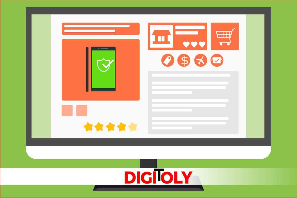
A professional eCommerce website design is necessary for your online success if you are running an eCommerce business. In different words, you’ll never get a sale if your visitors aren’t impressed with your site.
The look of your eCommerce site shouldn’t just amaze your visitors – it should also be well-organized and simple to navigate.
Important eCommerce Website Design Elements
When designing your eCommerce website, keep in mind there are three basic steps in an online shopping experience.
First, a user must find the product he is looking for with minimum possible effort.
Second, you must present the product very well. Third, you have to seal the deal with a flawless checkout process.
Finding the Product
The best eCommerce website design has the facility to cater to various user requirements in an integrated user interface.
For the people who know accurately what they are looking for, your job here is to help them find their preferred product in as few clicks as possible.
Some customers might require more hand-holding, whereas others just want to browse indifferently.
Each type of customer lays out unique challenges and unique opportunities as well.
As for easy functionality, it’s pretty well required that your search bar should provide relevant suggestions as soon as the customer begins typing some keyword.
This helps your customers to type a few characters and come up with prospective choices, without having to type out the entire name of the product.
This auto-complete attribute can also be supplemented to cross-market products associated with the product customers are looking for.
But, be careful to mark them as suggestions, and not the actual results. Otherwise, your customer might drift off not finding his desired product.
Showcasing the Product
Humans are visual creatures and showing them clearly and good quality images are the key to presenting your product.
If your website design doesn’t permit you to show the image at such a big size, make sure you give customers the option to view the image in a separate window.
Don’t offer them a zoom tool that confines them to a little quadrant of the image.
Price
First of all, show the price of the product boldly and clearly.
Don’t make people register or add the products to their shopping carts prior to letting them know the price of products.
This will surely irritate users and make them leave your website.
Show them the discounted price if you are offering them any, by striking off the real price below the discounted price because everybody likes to know if you are offering them a deal.
Reviews
Assign space for product reviews, because, it doesn’t matter how much you can boast the merits of your product with a fancy and detailed description, but users hardly believe it until it’s been confirmed by an independent customer.
Whereas positive reviews will inspire users to take the pitch and buy a product, negative reviews provide you a distinctive prospect to either alter the product or respond to customer concerns in public.
This proactive approach gives your website more credibility, which renders your loyal customers and manifold sales.
Add to Cart
Since your call-to-action lures the user to click on the “Add to Cart” button, you must give enough attention to optimizing it for conversions.
It’s your most significant button, so don’t conceal it. Use bold colors that distinguish well with your design and grab attention.
Choose a color that is not used anywhere else in the design to make it clearly visible.
Sealing the Deal
While shopping is fun, but spending money is certainly not. Your job here is to get buyers through the payment as promptly as possible. Consider the following:
One-page checkout
Long forms with many steps necessitate the browser to load a new page, turning up detrimental to a customer’s patience.
So, keep just one page check out and ask customer’s to fill in only required information like shipping details, email, phone numbers, etc.
Use cookies
A cookie is usually a small piece of data sent from a website and stored in a user’s web browser while a user is browsing a website so that it can remember something about the user’s browsing history on your site.
You can put up this simple tool to remember a user’s shopping cart or browsing history. It helps users to pick up where they left off when they come again on your site.
Implementing the suggestions above may help enhance your conversion rate, and lead to happy, satisfied and loyal customers.


